Dash Dash is an ever improving resource for linux documentation and general programming with an emphasis on design. As a trained designer, I always felt the command line was a cryptic black box and only much later realized the power and simplicity of coding with unix commands.
Generating graphics at scale
After first learning to code, I became mesmerized by the work robots could do and the shear magnitude of their output. But as an early lil designer homie it didn’t seem reasonable to do mass scale design. Robots have bad taste.

Early graphic design bots
At some point design systems became all the rage, design at scale had arrived! But for the most part design systems revolve around product design, you know inputs and buttons…and more inputs.
An infamous company in SF brazenly tried to sick the robots on graphic design but that ended not well. I for one was genuinely excited about The Grid—their mission was great, the team incredible, but it’s an insanely hard problem to tackle.
Takeaway for me, let’s keep any future design bot ideas scoped nice and tiny.
Project inspiration
Ironically, I was lucky enough to work on the new designsystems.com website with the Figma crew. With my partner in crime Toni, we talked about writing scripts to auto-generate these gradient orbs based on the brand colors of the featured author’s company.
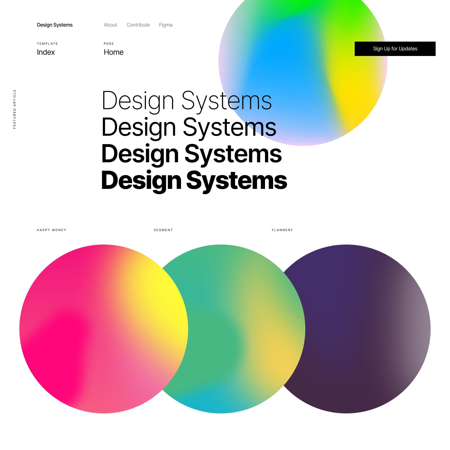
I started working on the scripts, but quickly realized, 1) it’s hard to make them look nice without manual curation and 2) we didn’t have that many featured articles (6 per year), so it’s MUCH faster to manually create them in Figma.
But I was hooked. The excitement of creating gradients and graphics with code got me hype!
Dash Dash
A few weeks later while I was yet again looking up how to move a gigantic folder of node modules using terminal (it’s mv btw), it hit me…
"What if every linux command has a micro-brand?”
What if every time you look up a command, it has a unique graphic style and type treatment? The design could feel like a poster and have a striking graphic design attitude. With thousands of open source commands, this seemed like a low stakes way to test dynamically generating a bunch of graphics with code!
Design
The graphic styling and concept sorta came hand-in-hand. While working on designsystems.com, I started to really get into using Instagram as a source for graphic design inspiration.
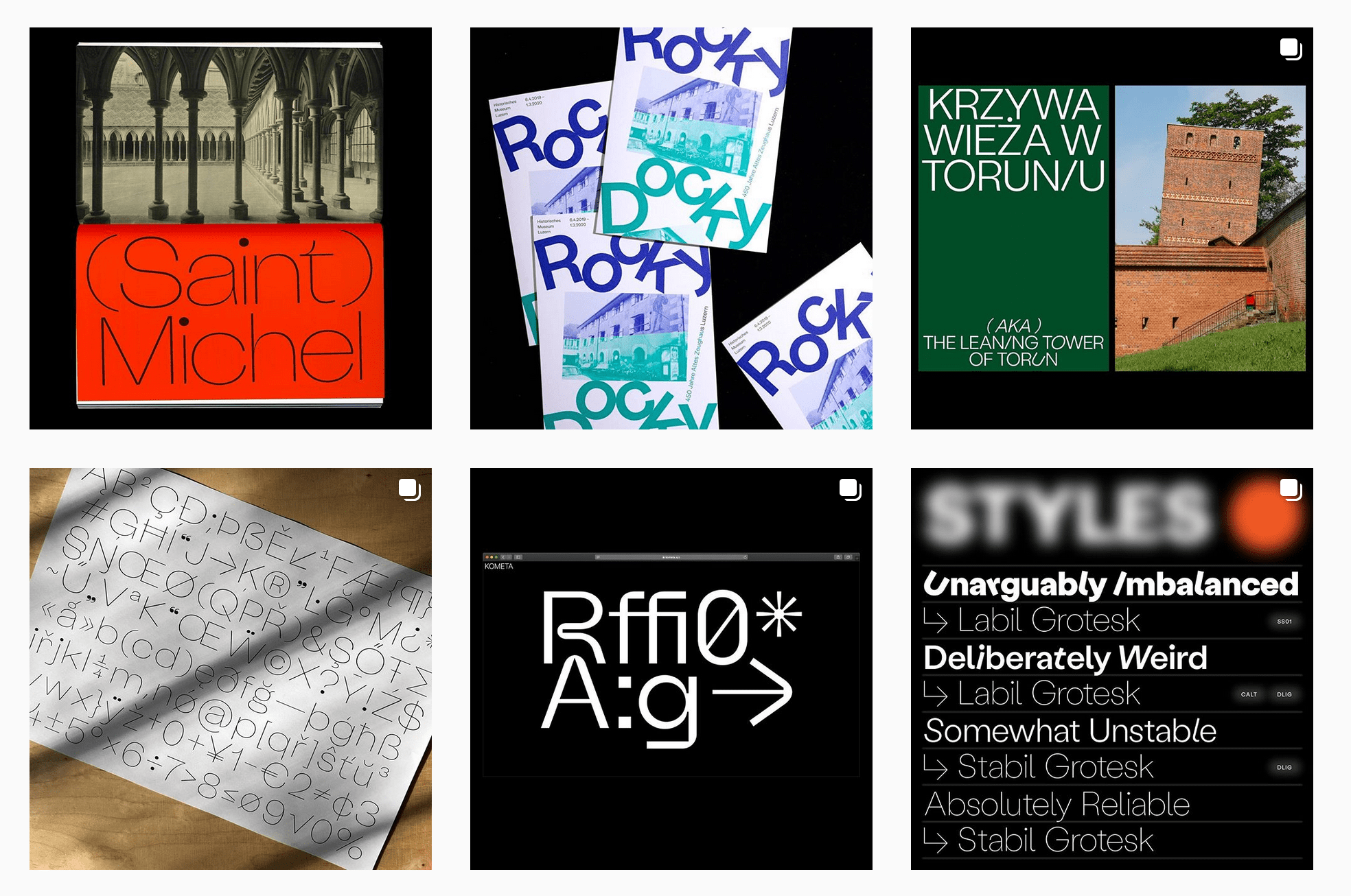
In particular the way Kometa seemed to push the way type and gradients worked together—I saved their fonts for a use case just like Dash Dash.
Another big inspiration for the site is designer Hrvoje Grubisic. Dude’s type work is killllller.
For the ever important body copy, I had already become a big fan of Rasmus' work on Inter—the only font used on designsystems.com. For Dash Dash, it's an unbelievably robust type and the font-feature-settings really put it over the top for code documentation.
Trying to whip up a quick side project in 30 days to get back on the shipping boat.
— Moe Amaya (@moeamaya) April 19, 2019
Dash Dash will be a site to look up linux/unix commands.
Messed around a bit this morning on the homepage but it's still pretty sloppy. Excited to do the dithering effect in javascript tho! pic.twitter.com/DverqGuRRq
(Ignoring that whole 30 day thing I wrote above) The 90s hacker aesthetic and deep commitment to type was evident early on. But what I hadn’t quite grasped was how to apply programmatic design to all the different commands.
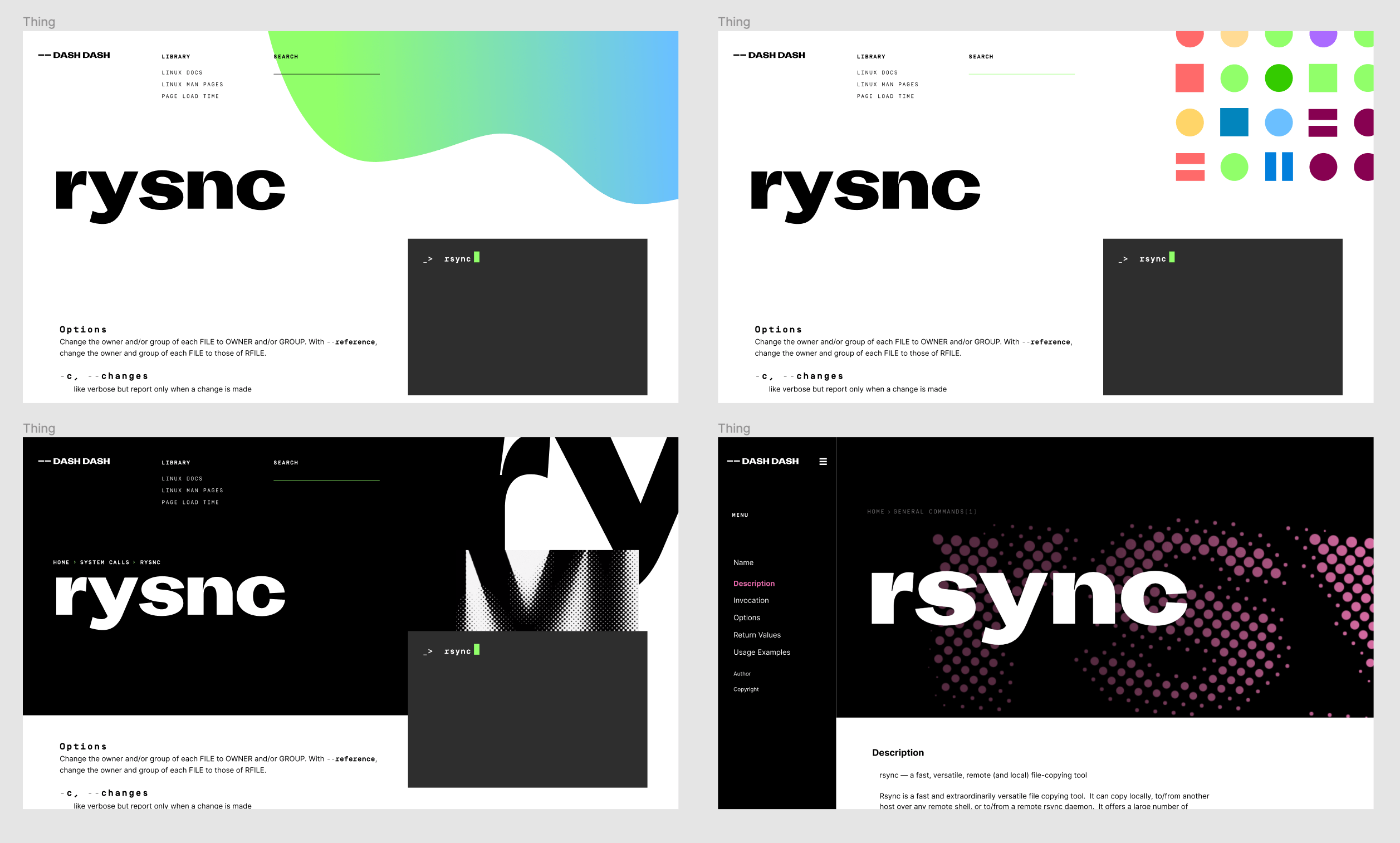
Since each command is by default a unique set of letters, I built my algorithm based on defining each letter with a specific design attribute.
- Gradient Shape - I started by borrowing the gradient idea from designsystems.com. I applied a color to all 26 letters and normalized the palette so it blended smoothly. I used the ascender and descender to draw the rough shape. The graphic itself felt a bit too cheesy and some iterations looked wiiiild.
- Color Patterns - Starting with the same color library from above, I tested some rules about generating circles, squares, and lines along with colors based on the previous letters. It started to get a bit convoluted but made some really nice patterns.
- Dithered Type - Ultimately I was smitten with typography and decided to keep things a bit simpler. I used the actual letters as a super graphic in the background and applied a single color to the graphic itself based on the section the command belonged to (there are 8 sections total).
Honest to the early dial-up internet styling but somehow a bit more digitally contemporary, the dithering felt like the perfect place to hone the programmatic design.
Code
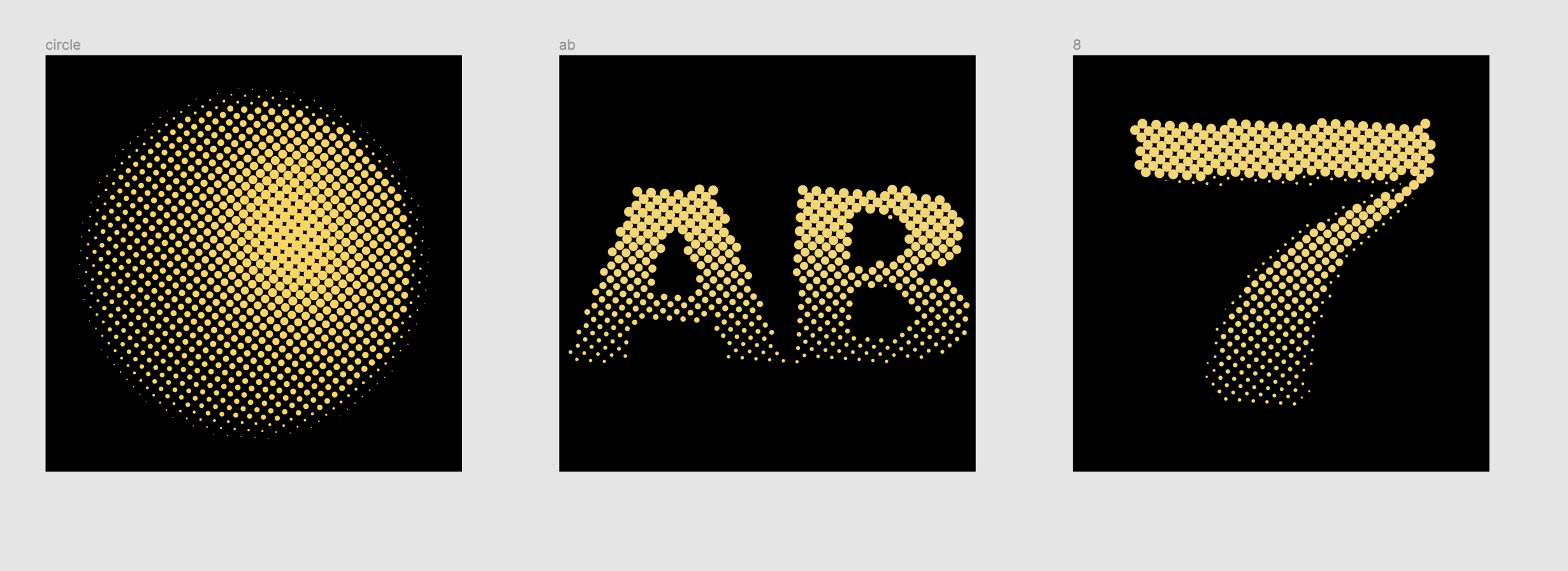
There’s only a few weirdos on the internet that love code and unnecessarily difficult to execute design ideas, but thankfully Dave DeSandro is one of us 😊 His Breathing Halftone project got me about 80% of the way there. The dithering and animation were already built in, I just had to refine the pattern falloff.
The way Dave’s halftone script works is that it takes in an image, calculates the gray scale value at certain points, and generates a scaled dot based on the gray scale value.
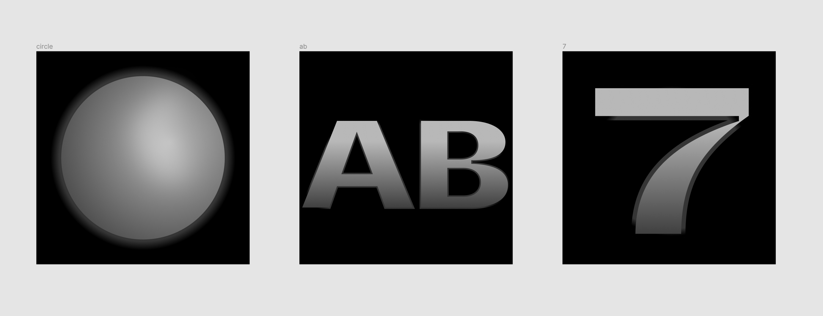
To test out the the visuals of the dithering, I built a bunch of versions of the above 3 images with different gradients, borders, shadows, etc. The final version images look a little strange, but when passed through halftone.js, the dithering effect is dynamic and highly contrasted.
To make this work at scale I had to:
- Wait for fonts to load using webfontloader.js
- Re-create Figma design using
<canvas> - Pass the generated image and color to halftone.js
- Render and animate the final graphic
The first time I got the code working, it felt magical…8k pages with nearly custom graphic work 🤯
So, why?
Dash Dash is but a tiny contribution to the idea of creating graphics at scale. This project started out insanely small: take some open source docs, add design.
But the project grew in ambition, complexity, and ultimately in meaning. As a kid that drew a lot and loved art, computers and programming scared the shit out of me.
For Dash Dash the seemingly extraneous details of animation, typography, and fun are actually really important to a younger version of me that would maybe not shy away from technology if it was made more approachable (and dare I say cool). As someone who learned to code at nearly 30, I hope that this project helps attract more people to the genuine wonders of code. It’s given me the ability to bring design ideas to life, build helpful tools, and work in a field that I love!